Harnessing the Power of Color: Branding Tips That Draw More Customers”
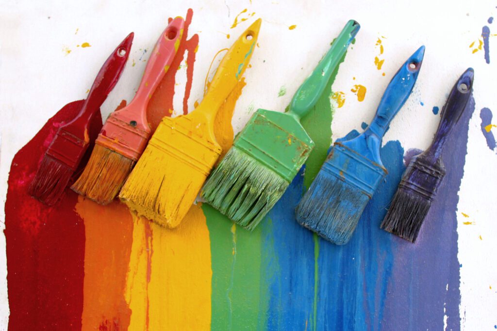
Want to attract more clients to your business? Did you know that research has shown that the color(s) you use in branding your business can directly affect its success?
Choosing your brand colors is serious business. Though it’s largely unconscious, colors are a huge factor in how we decide about the products or services we buy or desire.
It only takes 90 seconds for a person to develop an opinion about a product brand. It’s also estimated that a brand’s color alone determines a person’s buying decision up to 80% of the time.
If you own a business, this should get your attention, regardless of the industry you serve. So, what’s driving this?
As it turns out, color is an emotional experience. Ever notice that, if you like bright colors, you tend to purchase more products with them in their brand?
You may have developed your current brand (logo, website, brochure, etc.) solely based on your personal favorite colors. After all, our brand should reflect our personality, business style, and the type of clients we want to draw.
But without more intensive consideration, it can work against us.

Why It Works
Extensive research has been done on how colors create emotional appeal that directly affects our buying preferences. Each color elicits a specific emotional or physical response that helps us process and prioritize items based on how positive or exciting they feel.
Depending on what you are selling, you can also effectively pair certain colors together for a much stronger effect.
When I started my senior downsizing and home organizing business, Your Organizing Answer, back in 2009, I used a combination of 3 colors in my logo mark.
I used spring colors (green, orange, and yellow) to “brighten” the client’s perception of the service the first moment they saw my logo, brochure, or business card.
Expecting my client’s emotional response to be unconscious, I wasn’t prepared for the animated feedback I received from many clients about how emotionally lifted they felt just seeing the logo on my car, my uniform, or other branded items. They said it made them feel happier and more optimistic about a process (preparing for a downsizing move) they had been dreading.

The Emotion of Color
So, let’s walk through each primary color within the spectrum to understand the emotions they create.
Red
Red is a “Big Impact” color full of energy, desire, danger, passion, or love. It’s often used in the food and car industries because it’s quick to get your attention and a powerful emotional trigger.
Orange
Orange is a joyful, positive color. It elicits playful, creative energy. Less aggressive than red, it encourages a person to take action. Orange is popular in healthcare, food, technology, and youth-oriented products and industries because of its warmth and cheerfulness.
Yellow
What do you think of when you think of yellow? Many people consider it to be the color of happiness. Yellow creates a feeling of hope, energy, and warmth. This is the color to use to create a lighter, happier connection with your customers. It’s also been known to stimulate appetite, which is why it’s so popular in the food industry.

Green
This color represents peacefulness, growth, freshness, and vitality. Very popular in the food, holistic, or agricultural industries, it can mean different things to different people. For instance, it can be associated with good health, serenity, organic food and plant products, and wealth.
Blue
Blue is the color to consider when you wish to create confidence and trust in your clients. It’s used in finance, healthcare, travel, and technology and represents responsibility, dependability, and success.
Purple
Purple draws its color by combining two colors. It gets its energy and fire from red and combines it with the calmer, stability of blue. Purple is considered a rarer color in nature. For many, it adds a sense of mystery and richness. For that reason, it’s associated with the emotions of power, luxury, and royalty. Many companies in finance and technology use this color to elevate their services or product’s status when marketing to higher-income clientele.

Black
This color is frequently used in branding for companies that want to promote a feeling of power, luxury, or sophistication. It’s a color that can be sexy as well as elegant and powerful. Experts warn that depending on the presentation, it can also trigger darker, less positive emotions. Pairing black with other colors, like red, can temper that issue and make it feel more desirable and less threatening.
White
Using white in your branding as a primary color creates a feeling of cleanliness, innocence, or purity. Many cleaning product companies use a combination of white with the positive emotional attributes of blue and orange in their branding to create a crisp, but colorful image. Popular with the healthcare industries, children’s and nature-related products, this color can both excite and calm customers.
Are Your Current Brand Colors Working For You?
Now that you know the emotions that certain colors can create in a brand, there are two questions you should be asking yourself about your business’s branding and its current effectiveness.
- Do the current colors in my business brand create the emotional response I want from my customers?
- Are these colors working to my advantage in drawing and retaining the type of customers I want that will allow me to grow my business?
If the answer to either of these questions is no, you might want to step back and take a deeper look at your branding color scheme for any potential improvement opportunities.
More Resources
Still not clear on which colors to select? You can hire a color expert to help give you a deeper perspective and suggestions. You can also check out the wide variety of DIY material available on YouTube, online articles, or books on the subject and do a deeper dive.
Are you a professional home organizer or senior downsizing specialist? Learn more about branding and marketing tips specifically focused on the senior downsizing service industry in my “Marketing and Branding Your Business” online course by clicking here.
Deborah
